What good looks like
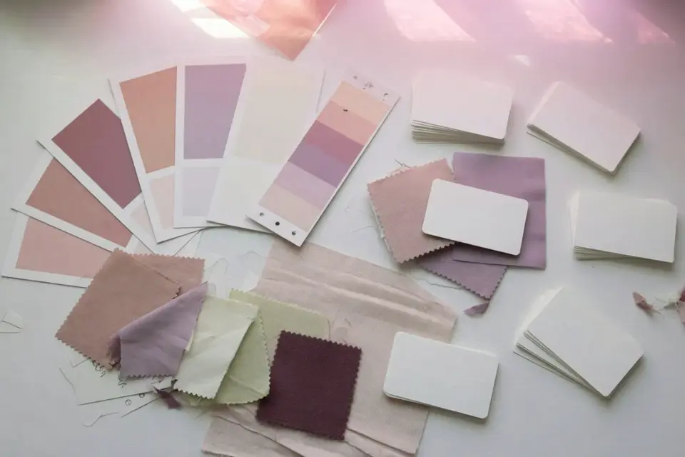
A professional still usually has:
- Clear subject hierarchy (you know what to look at in half a second)
- Believable light direction
- Intentional crop for the final placement (hero, square, story)
- Few or zero artifact taxes that take longer to fix than regenerate
- Finish: grade, type, and cleanup outside the generator when needed
Pretty is not the bar. Usable in context is the bar.
Workflow A — Hero still (marketing / web)
1. Brief the frame
Answer:
- Aspect (16:9 hero vs 1:1 ad)
- Subject + action
- Environment
- Light (window soft / hard noon / studio softbox)
- Brand adjectives (calm, loud, clinical, handmade)
- Forbidden list (neon, stock handshake, cluttered logos)
2. Build a prompt in layers
Subject: matte black pour-over kettle on oak counter
Setting: modern kitchen, morning
Light: soft window light from camera left, gentle shadows
Lens mood: 50mm, shallow depth of field
Style: photoreal product editorial
Palette: warm oak, cool stainless, muted greens
Composition: kettle left third, negative space right for headline
Add avoid list: busy background, harsh flash, readable brand text, extra handles, warped metal.
3. Generate a small batch
Produce 3–4 candidates. Pick by silhouette readability at mobile width, not only by texture porn at full zoom.
4. Critique against placement
Mock the still into a rough webpage or ad frame. Many “winners” die when type lands on a busy corner.
5. Refine
- Inpaint steam, reflections, or edge glitches
- Outpaint if crop is tight for responsive layouts
- Keep seed/composition when only light or material should change
6. Finish
Export → light grade → remove sensor-dust-like spots → add real typography in a design tool. Do not ask the model to spell your brand unless you enjoy proofreading disasters.
Workflow B — Style-consistent series (campaign set)
Clients rarely need one image. They need a set that feels related.
- Lock a style paragraph (light + medium + palette) reused every prompt.
- Lock camera height and lens mood.
- Vary only subject or scene.
- Prefer tools with reference / character / style controls when available.
- Build a contact sheet of six; kill outliers that break the set.
- Finish as a batch with the same grade preset.
If frame three looks like a different movie, the set is not a campaign—it is a collage.
Workflow C — Product accuracy (real object)
When the object must match reality (packaging shape, device ports, furniture proportions):
- Start from real photos of the product.
- Use img2img / product reference features at moderate strength.
- Prompt for scene and light, not inventing the object.
- Never trust the model to invent accurate UI screens—composite real UI or keep screens off.
- Legal: do not fake endorsements or alter safety-critical product details.
AI fantasy kettles are fine for mood. AI “exact SKU” claims are not.
Workflow D — Concept art and exploration
Exploration allows messier Stage 3:
- Wide prompt families (three style directions).
- Larger batch for direction only.
- Art director picks one direction.
- Then switch to production rules (small batches, one variable).
Timebox exploration (30–60 minutes). Endless concepting is procrastination with receipts.
Composition controls worth learning
| Control | Why |
|---|---|
| Aspect ratio first | Wrong aspect wastes everything downstream |
| Subject placement words | left third, centered, overhead, wide establishing |
| Lens language | 24mm environmental vs 85mm portrait compression |
| Light language | direction + softness + color temperature |
| Negative / avoid lists | Model-specific failure modes |
When available, pose, depth, or edge control beats rewriting the same prompt twenty times hoping geometry improves.
Iteration pattern that actually teaches you
| Pass | Change only | Question |
|---|---|---|
| 1 | Base prompt | Is the idea legible? |
| 2 | Light | Does light match brand? |
| 3 | Lens / DOF | Does depth feel intentional? |
| 4 | Palette | Do colors match references? |
| 5 | Detail cleanup | What must be inpainted? |
If you change light and lens and style every time, you learn nothing.
Worked example — quiet tea brand hero
v1 prompt (compressed): ceramic cup on linen, morning light, photoreal.
Result: Nice cup, but café neon sign in background—brand fail.
Critique: Kill neon; keep cup angle and linen texture.
v2: same subject, “minimal home kitchen, soft north window light, no signage, muted sage palette,” avoid neon, logo, text.
Finish: crop for 16:9, slight warmth, headline set in Figma on negative space.
Archive the “no neon” rule in the brand negative list forever.
Artifacts checklist (stills)
- Hands and fingers (if any body parts appear)
- Text and labels
- Reflections that invent extra objects
- Edges that melt into background
- Over-smooth skin plastic if people appear
- Inconsistent shadows
If fix time exceeds ten minutes, regenerate with tighter constraints.
Finish stack recommendations
| Goal | Finish move |
|---|---|
| Web hero | Gentle contrast, web-safe sharpening, correct export size |
| Upscale thoughtfully, soft proof, human retouch | |
| Social | Crop variants first; do not stretch |
| Ads | Safe margins for platform UI chrome |
Generators do not know your ad account’s crop rules. You do.
Tool choice (short)
Use the AI creative tools scorecard for weighted picking. Rough defaults:
- Aesthetic concepting → strong aesthetic models
- Client commercial comfort → tools with clearer licensing stories + Photoshop finish
- Privacy / custom style → local or fine-tune friendly stacks
Ethics and rights (short, important)
- Do not deliberately imitate a living artist’s name as a style shortcut for commercial work without understanding the risk.
- Do not generate trademarked characters or celebrity likenesses for brand campaigns.
- Disclose AI use when a client, platform, or contest requires it.
- Rights details vary by vendor—read terms; this site is not legal advice.
More in later rights pages; until then, when money is on the line, ask counsel.
Next
- Run Workflow A on a real asset you need this week.
- Save prompts + seeds.
- Continue to AI video workflows if motion is next.
- Compare tools with the scorecard.
Published by Tabaconda LLC, Florida, USA.
Related tools & gear
Useful physical tools for image production work. One optional product (see disclosure). Buy only what you need.
- Calibrite Display 123, model CCDIS123, USB-C, up to two monitors. A Display Pro and a ColorChecker Passport are different listings.
- Gray card
- Tripod